






















OUT STORY INDIA INTRODUCES A BOLDER IDENTITY FOR A NEW ERA
Out Story India has launched its newly redesigned logo, presenting a fresh identity that reflects strength, credibility, and

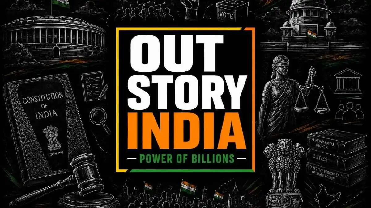

Out Story India has launched its newly redesigned logo, presenting a fresh identity that reflects strength, credibility, and the growing influence of independent journalism. The transformation represents the platform’s commitment to fearless reporting, impactful narratives, and conversations that matter to the public.
Built with a strong contemporary visual style, the new logo reflects confidence and purpose while maintaining a deep connection with the audience. The design aims to represent a media platform that speaks with clarity, stands with facts, and amplifies voices that deserve attention.
The black background reflects authority, depth, and a strong foundation built on truth and accountability.
The white text symbolizes openness, accuracy, and transparent journalism.
The saffron-orange shade represents bold thinking, courage, and the fearless nature of storytelling.
The green element highlights progress, inclusiveness, and the collective voice of society.
The yellow accents symbolize energy, awareness, and impactful public conversations.
The tagline “Power of Billions” represents the belief that true influence lies in the voices of ordinary people. With its refreshed identity, Out Story India steps forward with a sharper vision and a stronger commitment to stories that shape the nation.